By Paige Cochran
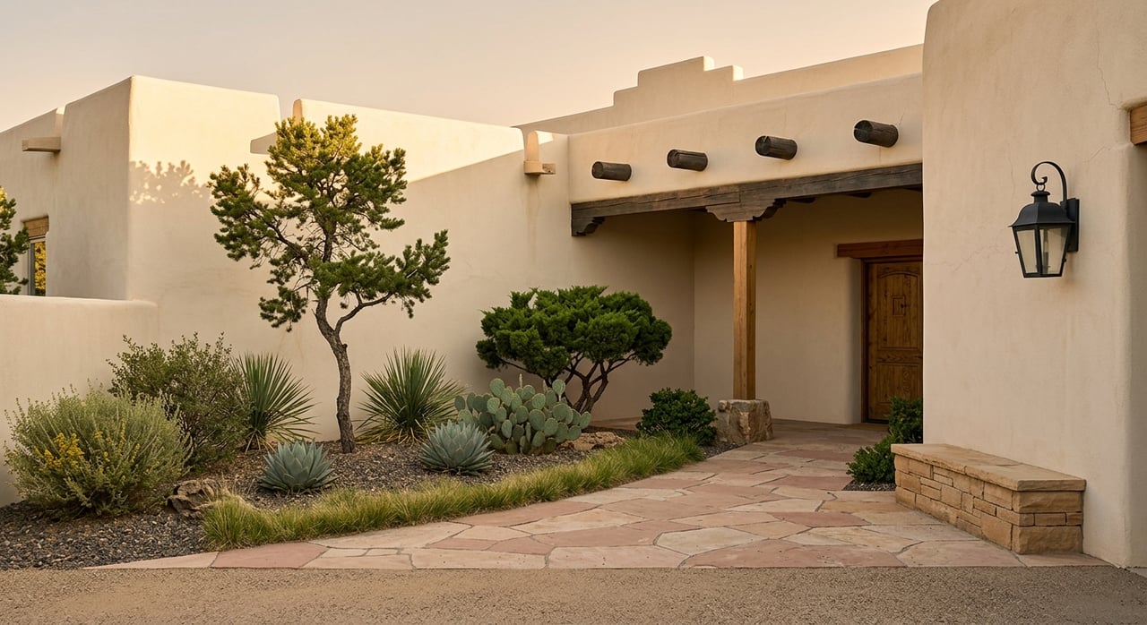
Santa Fe has a way of making you think differently about color. The high desert light is unlike anything you will find on the coasts or in humid climates; it is sharp, clear, and deeply warm by late afternoon, and it transforms the way paint tones read on walls. A shade that looks muddy and flat in a showroom can become luminous in a Santa Fe interior, while a color that photographs beautifully in a Pacific Northwest home might wash out entirely under the New Mexico sun. If you are painting a home here, the science behind color really does matter.
Choosing the right paint tones is one of the most impactful decisions you will make in a home renovation or a staging project, and it is also one of the most misunderstood. Most homeowners rely on gut instinct or Pinterest boards, ending up with shades that work against their architecture, their furnishings, or their natural light. In Santa Fe, where homes range from centuries-old adobe properties to contemporary stucco builds, the stakes are even higher. The wrong color palette can make a space feel cold, muddy, or out of place. The right one, however, amplifies everything the property does well.
This guide walks you through how color actually works in Santa Fe homes, what the science of light and pigment tells you to consider, and how to make confident choices, whether you are refreshing a single room or preparing an entire property for sale.
Key Takeaways
- Santa Fe's high-elevation light is cooler and more intense than sea-level light, which changes how paint tones appear throughout the day.
- Warm undertones in neutrals tend to perform best in adobe and stucco interiors because they complement the natural tones of the architecture.
- Testing paint swatches in your actual space at different times of day is essential before committing to a color.
- Earth tones, terracottas, and muted sages have strong staying power in Santa Fe's market and appeal broadly to buyers.
- Finish matters as much as color; the wrong sheen can make even a well-chosen hue look flat or overly shiny.
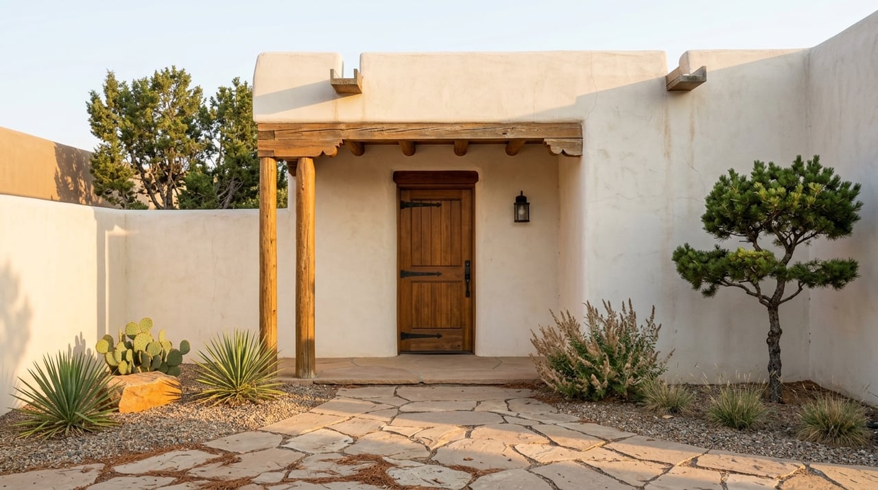
How Santa Fe's Light Changes Everything
The science starts with light. Santa Fe sits at a high altitude of over 7,000 feet, which means less atmospheric interference and more intense UV exposure. Natural light here is brighter and more directional than in lower-elevation cities, particularly during midday. That directional quality creates sharp shadows and high contrast between sunlit and shaded surfaces, which affects how paint colors register in a room.
Colors with cool or blue undertones tend to look harsher under Santa Fe's overhead light, particularly in rooms with south or west-facing windows. What reads as a soft blue-gray in a Scandinavian loft can feel stark and institutional in a Territorial-style home bathed in afternoon southwestern sun. Conversely, paint with warm yellow, ochre, or red undertones tends to absorb that light more gracefully, deepening rather than bleaching as the day moves on.
Interior designers working in New Mexico often talk about the "golden hour effect" that happens between 4 and 7 p.m. The slanted light that comes through west-facing windows casts a warm amber glow across every surface, and this is actually useful information when choosing paint. A color that holds up through the harsh midday light and still looks beautiful in that late-afternoon warmth is one worth committing to. That is a real and repeatable test you can run in your own home.
What the Light Science Tells You
- Test swatches on north-facing and south-facing walls separately, since they will read very differently in the same room.
- Observe your sample colors at three distinct times: morning, noon, and the hour before sunset.
- Avoid making final decisions under artificial lighting alone; LED and incandescent bulbs each distort undertones in specific ways.
- The larger the swatch, the more accurate your read; a 12-by-12-inch painted sample will tell you far more than a chip from a paint fan deck.
Understanding Undertones
Adobe and stucco are porous, earthy materials with naturally warm undertones in the red, tan, and umber family. Any paint color you introduce into a Santa Fe interior is going to exist in relationship with those surfaces, whether that is the raw adobe of an old wall, the smooth plaster of a newer build, or the textured stucco of an exterior facade. Understanding undertone relationships is the key to making that relationship work.
A neutral that appears perfectly balanced on a painted drywall surface can shift noticeably when placed next to the organic tones of a plastered adobe wall. If your neutral has a pink undertone, the adobe will amplify it. If it has a green undertone, the result can look muddy or sickly against warm earth. The neutrals that perform most consistently in Santa Fe interiors are those in the warm white, linen, parchment, and greige categories; shades that share the same red-yellow color family as the materials around them.
This does not mean your home needs to be monochromatic. Many of the most striking interiors in Santa Fe use strong accent colors against warm neutral backgrounds. Deep indigo, Saltillo orange, and muted turquoise all have long histories in local design traditions, and they work precisely because they are offset by earthy, grounded neutrals rather than cool or stark whites.
Undertone Pairings That Work in Santa Fe Homes
- Warm white or parchment walls paired with raw wood vigas create a layered, cohesive look without competing undertones.
- Greige (a gray-beige hybrid with warm undertones) functions as a versatile neutral in rooms with significant natural stone or Saltillo tile.
- Deep terracotta or brick red as an accent works best against a base of soft linen or cream, never against cool gray.
- Muted sage or olive green reads as fresh without feeling out of place, particularly in outdoor-facing rooms with views of the Sangre de Cristo mountains.
The Role of Color Temperature in Room Function
Color temperature is not just a concept for photographers and lighting designers. In interior paint selection, it refers to whether a hue creates a feeling of warmth or coolness in a space, and that feeling has a measurable effect on how you experience the room. Warm colors advance visually, making the walls feel closer and spaces feel more intimate. Cool colors recede, which can make a small room feel larger or a bright room feel more serene.
In Santa Fe homes, this principle is particularly useful in navigating the mix of small and large spaces that characterize traditional Southwestern architecture. Zaguan hallways, banco-lined sitting rooms, and low-ceilinged portales all benefit from thoughtful color temperature choices. A warm, deep tone in a compact hallway can make the space feel intentional and rich rather than cramped. A cool blue or lavender in a sunlit great room can offset the intensity of midday sun streaming through clerestory windows.
The key is understanding the function you want each room to serve. Bedrooms, where rest and calm are the goal, often benefit from cool, muted tones. Kitchens and dining rooms, where warmth and conversation are the aim, tend to favor colors in the terracotta, warm white, or golden yellow grouping. Living rooms frequently occupy the middle ground; a warm neutral on the walls with cool or jewel-toned accents in furnishings and art gives the space flexibility across purposes and seasons.
Matching Color Temperature to Room Use
- Use warm tones in dining rooms and kitchens to encourage a sense of comfort and appetite.
- Reserve cool tones for bedrooms and home offices where calm focus or rest is the priority.
- In open-plan spaces, use a single warm neutral throughout and introduce temperature variation through rugs, textiles, and art.
- Pay attention to how window orientation amplifies or softens the temperature of your paint; north-facing rooms always feel cooler, regardless of color choice.
Choosing Colors That Hold Value in Santa Fe's Market
If you are painting a home with an eye toward resale, the science of color choice intersects with the psychology of buyers. Santa Fe has a distinct architectural identity, and buyers in this market are often specifically seeking a connection to that aesthetic. Colors that feel authentically rooted in the high desert palette tend to perform well at resale; those that feel imported from another design tradition can make a home feel disconnected from its setting.
The colors with the strongest track record in Santa Fe's resale market are warm and earthy without being dark or heavy. Think of the tones you see in the landscape itself: the pale buff of sandstone, the warm ochre of dry grasses, the muted sage of chamisa in late summer, and the red-clay richness of the earth after rain. These are not trendy colors in the way that millennial gray or greige became trends in other markets; they are regionally specific and deeply durable.
Exterior paint choices are especially consequential in Santa Fe. Working within the palette does not mean every home needs to look identical; the range of warm earth tones, from pale sand to deep adobe red, gives you enough variety to make a property feel distinctive while still reading as authentically Santa Fe.
Colors With Strong Resale Appeal in Santa Fe
- Pale buff, sandstone, and warm cream for primary exterior and interior walls.
- Deep terracotta or warm brick tones for accent walls, portales, and entry spaces.
- Muted turquoise or deep indigo as accent colors in kitchens, bathrooms, and built-in shelving.
- Soft sage or dried-grass green for secondary bedrooms and outdoor-adjacent spaces.
FAQs
What Paint Colors Are Most Popular in Santa Fe Homes?
The most consistently popular colors in Santa Fe interiors are warm earth tones, including cream, parchment, buff, terracotta, and muted adobe red. These shades complement the stucco and adobe materials that define most homes in the area and hold up well under the region's intense natural light. Turquoise, indigo, and sage are popular accent choices.
How Do I Know If a Paint Color Has a Warm or Cool Undertone?
Hold your paint chip next to a piece of pure white paper. If the chip looks yellowish, peachy, or reddish against the white, it has warm undertones. If it looks slightly blue, green, or lavender, it has cool undertones. You can also compare chips directly against each other; laying a warm beige next to a cool beige makes the difference immediately obvious. For the most accurate read, look at chips in the space where the paint will be applied, not just in a showroom.
Should Interior and Exterior Paint Colors Match in Santa Fe?
They do not need to be identical, but they should be harmonious. A warm buff exterior that transitions to a slightly richer parchment or linen inside creates a cohesive experience as you move through the home. Abrupt shifts between the exterior palette and interior color can feel jarring and disconnected. Many Santa Fe designers use the same color family inside and out, simply adjusting the depth of the tone for each application.
Paint With Confidence in the High Desert
Color in Santa Fe is not arbitrary. The high-desert light, the earthen architecture, the regional design heritage, and the specific nuances of the resale market all point toward a palette that has evolved.
If you are preparing your Santa Fe home for the market or simply want to maximize what your property has to offer, I would love to help you think through the details. Reach out to me, Paige Cochran, and let's talk about what your home needs to look its very best.
If you are preparing your Santa Fe home for the market or simply want to maximize what your property has to offer, I would love to help you think through the details. Reach out to me, Paige Cochran, and let's talk about what your home needs to look its very best.